4K Converter
Upscale Screenshots: Make Small Text Larger Without Trusting Guesswork
Choose between recapturing, resizing, and AI enlargement, then check letters and numbers before using a screenshot in a guide or presentation.
A screenshot fits a slide, but its tiny labels become hard to read when enlarged. Increasing the pixel count is one option; getting a better source is another. Adobe's resizing guidance distinguishes resampling, which changes pixel dimensions, from resolution changes that leave the pixel count alone.
For screenshots, readable-looking letters are only part of the goal. The words, numbers, and connections in a diagram must remain correct. Use the workflow below to decide whether enlargement is appropriate and how to judge the result.
Find out why the screenshot looks soft
First open the downloaded or original image outside the document where it looks blurry. Check its pixel dimensions and view it at 100% as well as at its intended delivery size. A document preview can look soft even when the underlying file is adequate.
Then compare those dimensions with the placement. A 640-pixel-wide screenshot stretched across a much wider area asks the viewer or editor to invent intermediate pixels. If the final layout allows it, making the placement smaller may solve the readability problem without processing the image.
Look for existing damage too. Repeated JPEG saves, messaging-app compression, and screenshots of screenshots can leave small text surrounded by artifacts. A larger copy of that file may simply make the damage easier to see.
Recapture when the source is available
If you still have the web page, application, or design document, return to it. Increase the source text size or application zoom where appropriate, then capture the relevant area again. Check that zooming has not hidden a control or changed the layout you need to explain.
For a diagram or chart, prefer an export from the original project when possible. Keep any vector version for workflows that support it. If you need a PNG, export at dimensions suited to the destination rather than capturing a small on-screen preview.
For a how-to guide, a focused crop can be more readable than a whole desktop squeezed into a narrow column. Keep enough surrounding context to locate the control, and put longer explanations in ordinary page text instead of inside the image.
Prepare a clean screenshot file
Start with the original screenshot. Remove unrelated desktop areas before upload and save that prepared source separately. Choose a still PNG, JPG, or WebP supported by the current image tools.
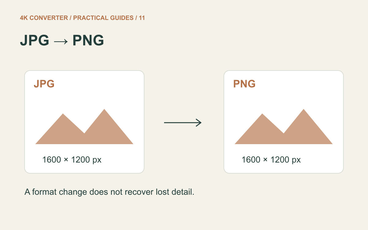
PNG is useful for screenshots containing text and hard edges; the MDN image-format guide discusses these format tradeoffs. Changing an already compressed JPG to PNG does not reverse its damage, as the JPG to PNG guide explains.
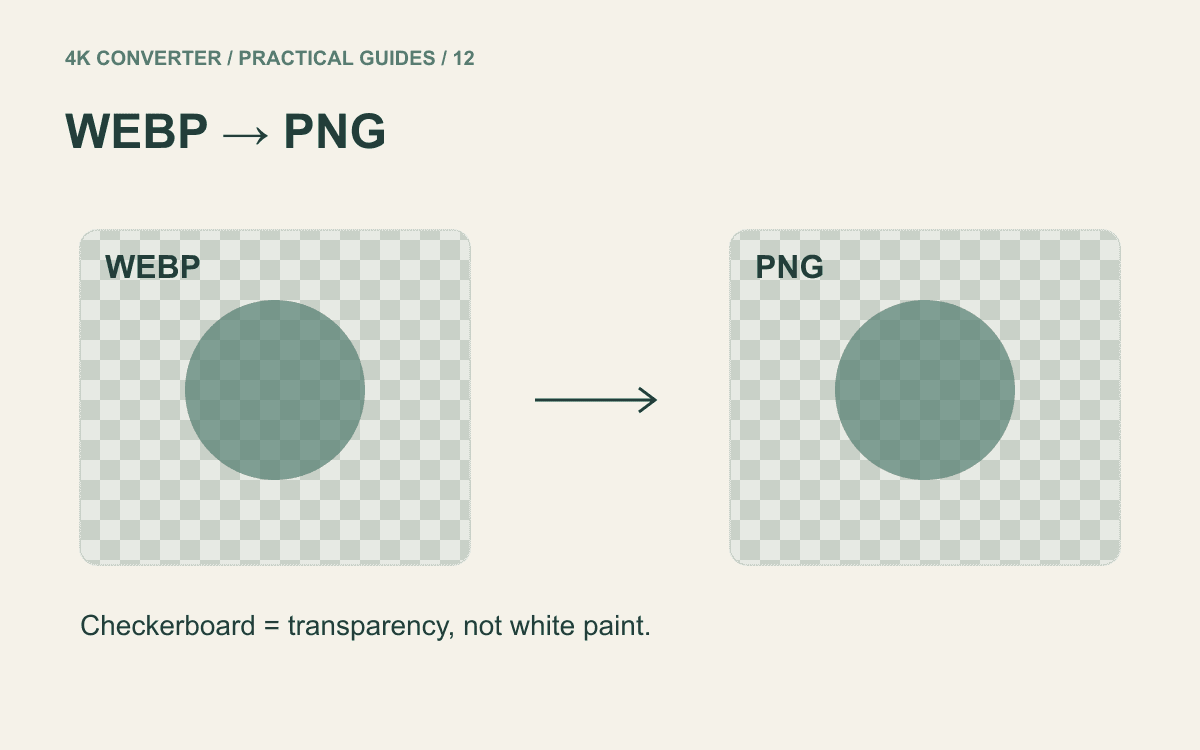
Avoid repeated round trips between formats. If the source is a WebP and your editing workflow requires PNG, make one deliberate WebP to PNG conversion, then continue from that prepared file.
When to test an AI enlargement
If the source application is no longer available and a larger illustration is needed, test one representative screenshot in the image upscaler. Include small labels and fine lines in the sample; an empty toolbar tells you little about the difficult parts.
- Select the prepared screenshot and an appropriate target size.
- Review the proposed dimensions and credit quote before starting.
- Process the image and download the result.
- Compare it with the source at matching display sizes, then inspect important details closely.
The tool enlarges images; it is not a text-recognition or document-reconstruction workflow. It does not return verified text or editable interface controls. Do not assume that an apparently sharper word is the word originally displayed.
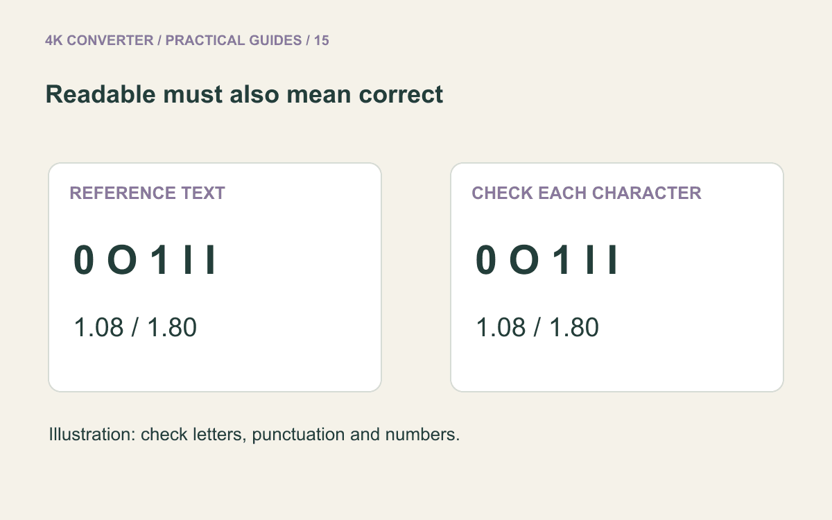
Check the content character by character
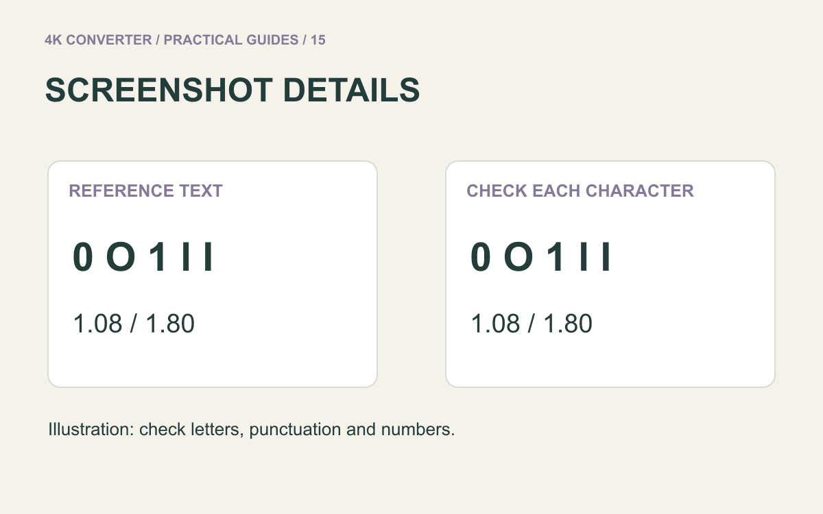
Read every important label against a reliable reference. Check 0 against O, 1 against l, decimal points, minus signs, dates, and units. A smooth outline around the wrong digit is still wrong information.
For charts and diagrams, follow the lines rather than checking only text. Are arrowheads still pointing to the right item? Did two nearby lines merge? Are the legend and axis labels consistent with the original?
If an important word cannot be checked, use a separate, verified text annotation or describe the uncertainty in the surrounding prose. For an instructional document, retyping a confirmed label beside the screenshot can be more useful than enlarging it again.
Finally, place the chosen version into the actual slide, page, or document and review that export. A result that looks good in a full-screen viewer can still be too small in the final layout. Keep the original and identify the edited copy clearly.
Common questions
Can AI reliably recover unreadable text?
Do not rely on it for that. It may generate plausible-looking character shapes without establishing the original wording. Use the source application, document, or another reliable reference to verify text.
Does changing a screenshot to 300 DPI add detail?
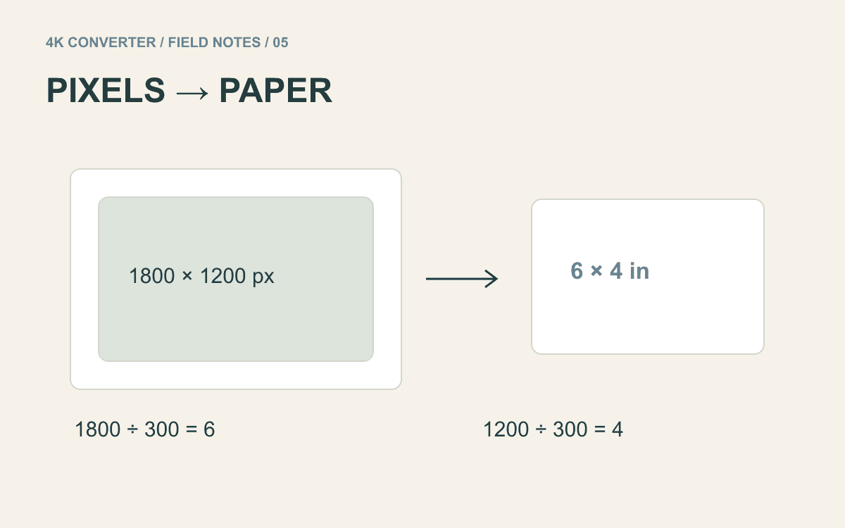
Changing only the resolution tag does not add pixels. Printing needs a separate size calculation; see upscaling images for printing.
Should every screenshot be enlarged to 4K?
No. Match the image to its intended placement. A better capture, a focused crop, or a smaller display area may make the instructions clearer without AI processing.