4K Converter
Upscale Anime Images: Preserve the Drawing Behind the Pixels
Enlarge a static illustration while checking line weight, eyes, flat colors, and lettering. Start from the artwork file when it is available.
A small anime illustration may look soft on a wallpaper, presentation, or print layout. Before enlarging a flattened export, look for the editable artwork. Clip Studio Paint's vector-layer documentation distinguishes pixel-based raster layers from lines represented by paths and control points. Those source types offer different ways to produce a larger image.
If all you have is a static PNG, JPG, or WebP, make a test enlargement and inspect whether it preserves the drawing. Smooth edges alone do not establish that a character's expression or the artist's line choices survived.
Look for the artwork before enlarging an export
For your own illustration, reopen the original project when possible. Check the canvas and export settings, and make a suitable raster export from that file. Editable text and vector lines give you options that a screenshot of the finished picture does not.
If the image came from a collection of exports, choose the largest clean version. Avoid screenshots that include a viewer interface, scaled previews, or already compressed social copies. Keep the source untouched so you can compare each candidate against the same reference.
The image upscaler accepts JPG, PNG, and WebP raster images. It does not read layered illustration projects or return editable vector strokes. A larger PNG remains a raster image.
Identify what defines the drawing
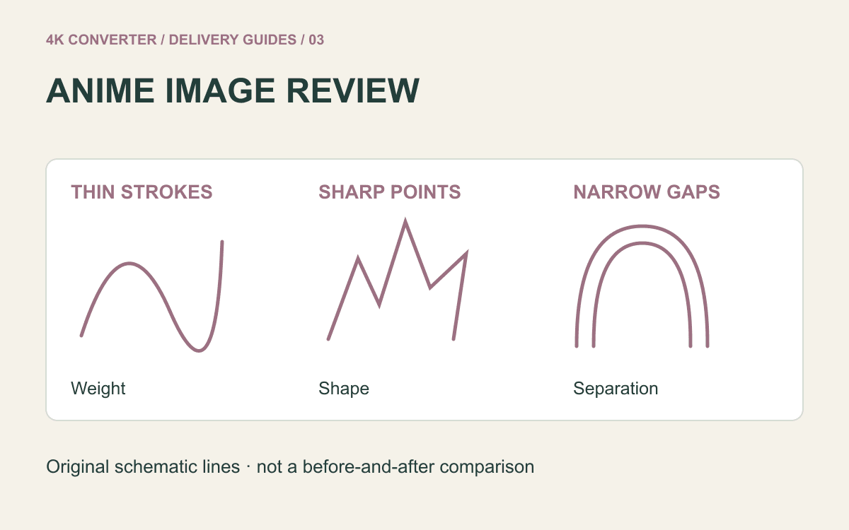
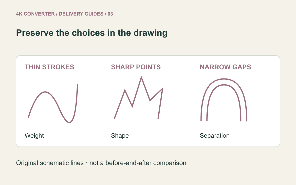
Pick several details before processing: an eyelid, a sharp hair tip, two closely spaced outlines, a flat shadow boundary, and a word or signature. These are useful checkpoints because a small change can alter the illustration's intended shape or expression.
Do not assume that every visible texture is unwanted noise. Screentone, hatching, a rough brush edge, or a deliberate pixel pattern may belong to the style. Removing it can make the result cleaner while making the drawing less faithful.
For pixel art, decide whether preserving a deliberate grid is essential. An AI workflow that suggests smoother contours may be the wrong choice for that goal. Use a dedicated scaling approach when exact pixel blocks are the design.
Upscale one static image for comparison
- Save the cleanest available source and decide where it will be displayed.
- Open the image upscaler and upload a supported still image.
- Choose an available output resolution and format; PNG can be a useful review copy.
- Start processing and download the candidate separately.
- Compare the chosen details with the source before using the result.
The current interface offers a general image-enhancement workflow. It has no dedicated anime model selector, line-preservation switch, or editable layer export. Treat suitability for your drawing as something to test, not a promised property of the tool.
Selecting PNG does not prove that transparency survived the processing step. If the illustration needs a transparent background, inspect the actual output over contrasting backgrounds.
Inspect lines, expressions, and color blocks
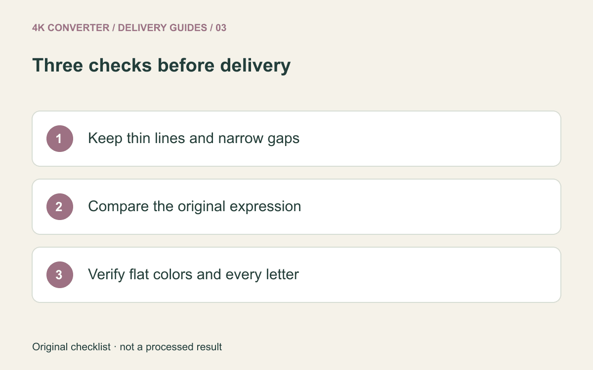
Check line weight first. Narrow strokes should not merge into dark patches, and thin gaps should not disappear. Look at curved outlines and sharp points for doubled edges, halos, or rounded-off corners that were not in the source.
Then compare the face as a whole. Small changes around pupils, eyebrows, or the mouth can change an expression. View the source and candidate at equal display size so the larger preview does not win merely by being larger.
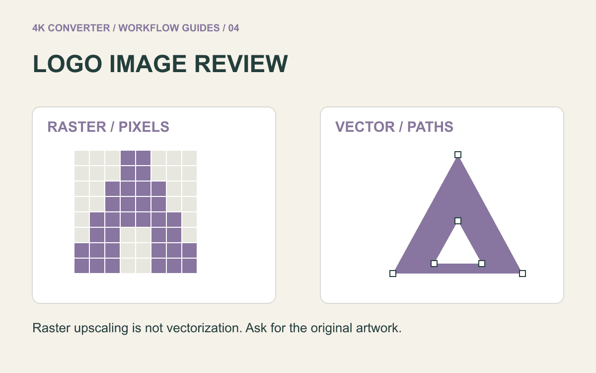
Inspect flat colors and gradients for unintended texture, blotches, or bands. Check every important letter rather than accepting text because it looks crisp. For wordmarks or symbols that require exact geometry, use the related logo review checklist.
Review the illustration at its final size
Place the image in the actual layout. A wallpaper may be cropped by the display; a slide may shrink small lettering; a print layout may need a different aspect ratio. Enlargement does not add the missing composition around a cropped subject.
Keep a reviewed master and make delivery copies from it. Avoid repeatedly upscaling an already altered result, since each pass gives you another candidate to check rather than a guaranteed improvement.
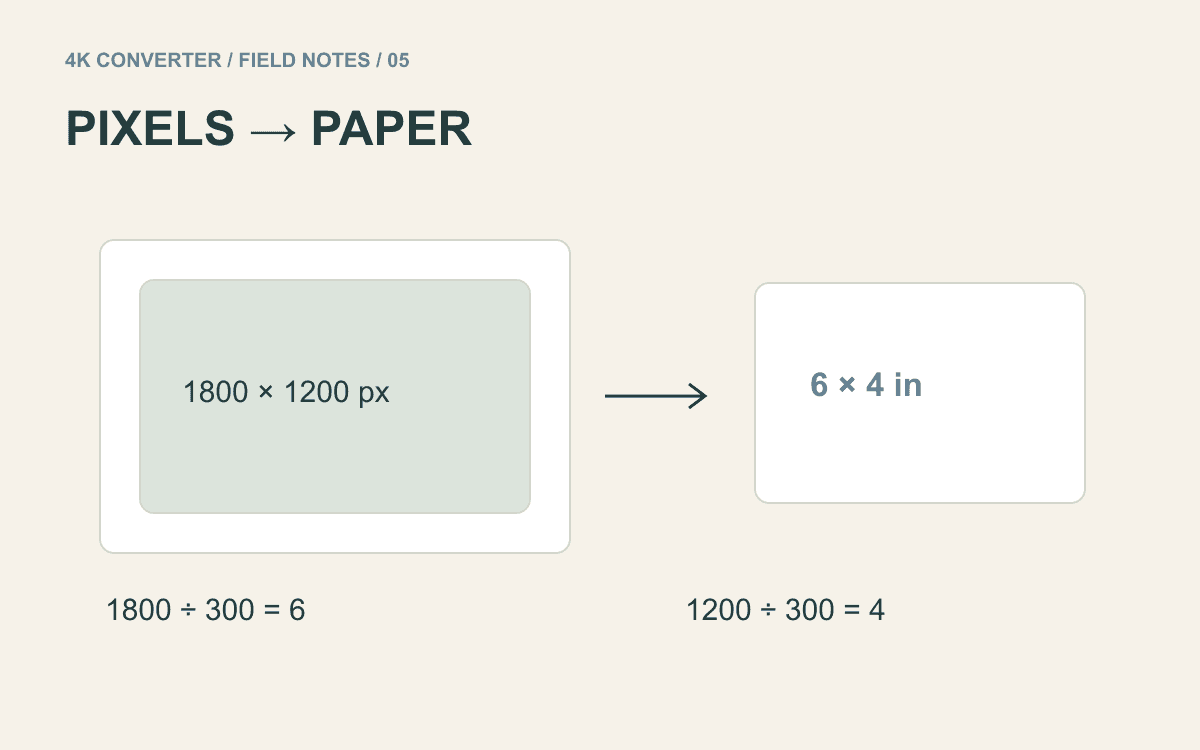
If the final use is print, verify physical size and produce a sample before a large order. The printing guide explains why a 4K label alone is not a complete print specification.
Common questions
Can this upscale an entire animated episode?
This article covers a single still image. Animation needs a video workflow and checks across frames; an image export does not preserve a complete animated sequence.
Will the tool preserve every drawn line exactly?
Do not assume so. Inspect the checkpoints against the original, especially tightly spaced strokes and facial features.
What if the image includes dialogue or small labels?
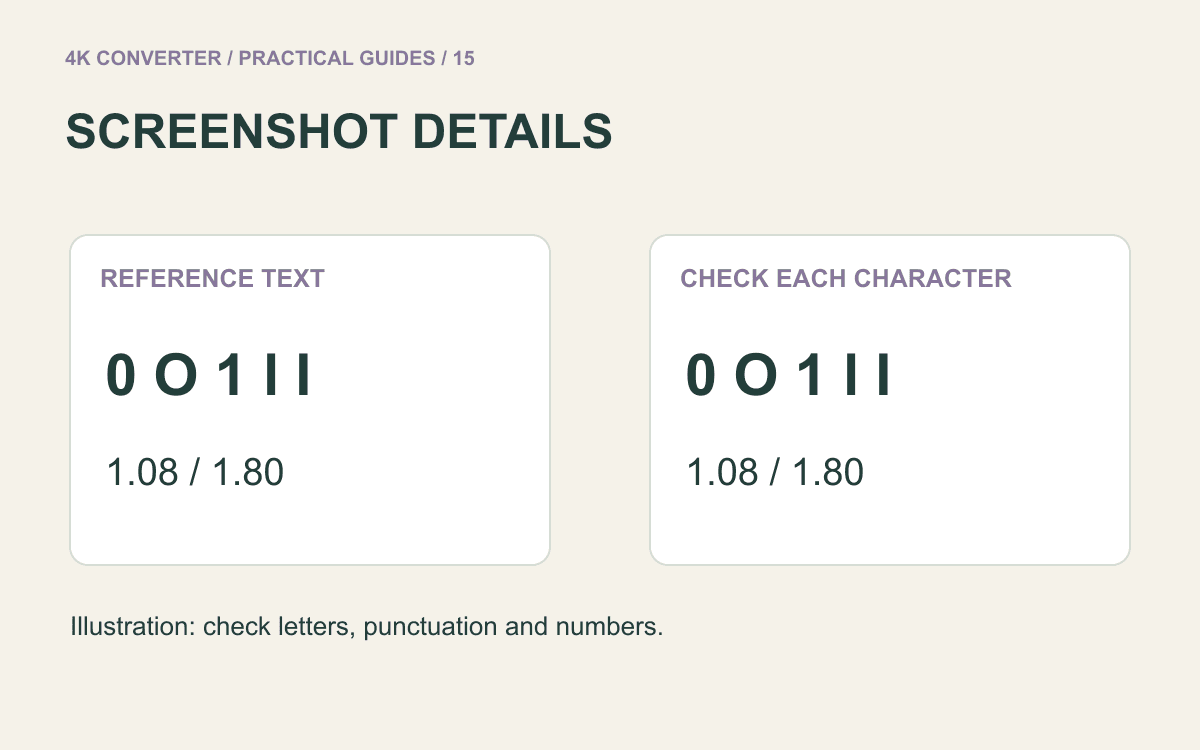
Read the text character by character. The screenshot enlargement guide offers a related checklist for text accuracy. If wording is unreadable in the source, obtain a clearer reference instead of approving guessed letters.