4K Converter
Upscale a Logo Image: Keep the Lettering and Shape Honest
Choose a vector source when one exists. When all you have is a small raster logo, enlarge a test copy and compare lettering, geometry, color, and the background.
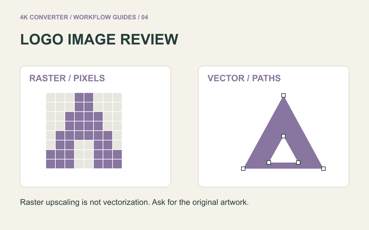
A small logo looks jagged in a slide or page header, so enlarging it seems like an obvious next step. First look for its original artwork. Adobe's raster and vector comparison explains the difference between pixel-based images and graphics described by paths. For a logo made from shapes and lettering, a vector original can avoid the need to infer missing pixels.
When a small PNG, JPG, or WebP is the only available source, an enlarged raster copy may still help. The key question is whether the result stays faithful to the approved mark, not simply whether its edges appear smoother.
Ask for the vector original first
Check the brand asset folder or ask the designer for the original vector artwork, such as an SVG or EPS, and an approved export. A file with a vector extension may still include an embedded raster image, so inspect its contents before assuming it can scale cleanly.
Use the brand's supplied variants when available: a dark mark, a light mark, or a small-size version may already solve the placement problem. Do not rebuild a wordmark from a similar font merely because the exact letters are hard to read in a tiny image.
This site's image upscaler accepts raster images. It does not accept a vector design as editable paths or turn a PNG into an SVG. Keep vector editing and raster enlargement as separate choices.
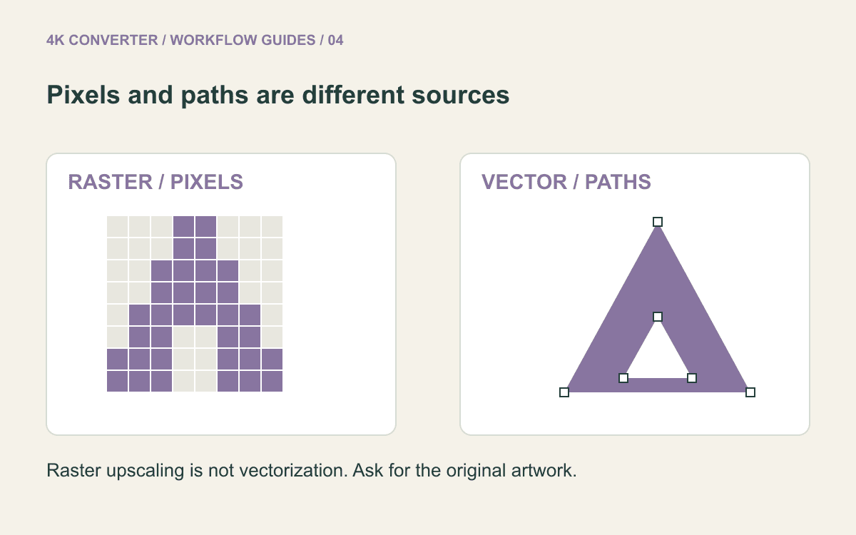
Decide whether raster enlargement fits
Start with the largest, least compressed approved raster copy you can find. A direct PNG export is generally a better reference than a screenshot of a logo inside a presentation. Crop surrounding page content in an editor if necessary, but preserve the mark's required clear space.
Decide where the output will appear and at what size. A slide, website header, and printed sign have different delivery requirements. Generating more pixels does not settle the layout size, printer specification, or brand approval.
If the source contains unreadable small lettering or severe compression artifacts, request a better original before relying on an inferred reconstruction. An attractive substitute can still be the wrong logo.
Make one enlargement for review
- Keep the approved source unchanged and note the intended placement size.
- Open the image upscaler and upload a supported JPG, PNG, or WebP.
- Choose an available output resolution and PNG as a review format when appropriate.
- Download the enlarged result as a separate candidate.
- Compare it with the approved source before putting it in a public design.
The tool preserves the aspect ratio when targeting the selected output size. It does not add a brand-aware lettering lock, a vector trace, or a color approval step. Selecting PNG also does not by itself guarantee that the AI workflow preserves a transparent background; inspect the actual result.
Compare the identity, not just the sharpness
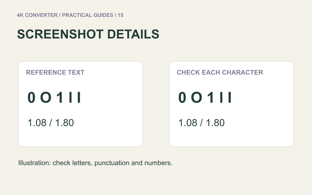
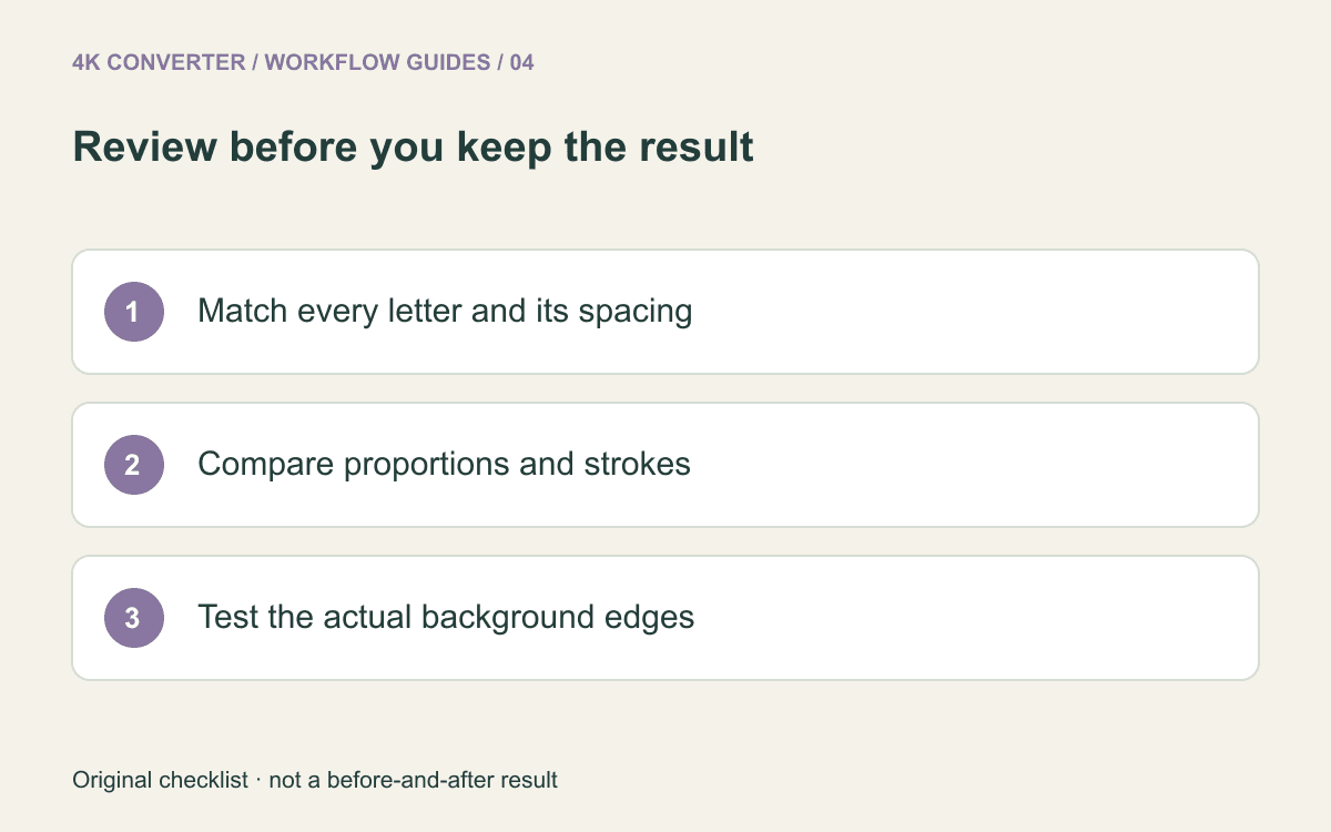
View the candidate beside the source at the same display size, then zoom in to inspect details. Check each letter, including punctuation, the spaces between letters, and the shape of enclosed areas such as the center of an “O”. A smooth but altered letter is a failed result.
Check the symbol separately. Are circles still circular? Do repeated strokes have consistent thickness? Are corner angles, relative proportions, and gaps unchanged? A fictitious sample in a diagram cannot establish accuracy for your real mark.
Compare color against the approved asset or brand specification in a suitable workflow. A brighter or more saturated result is not automatically a better match. Reject candidates that alter meaningful geometry or spelling rather than hiding the difference with a smaller preview.
Check the background and destination
Place the downloaded result over both a light and a dark background. Look for a rectangular fill, pale fringes, or dark halos. A checkerboard preview in one interface is not a substitute for testing the file in the actual design application.
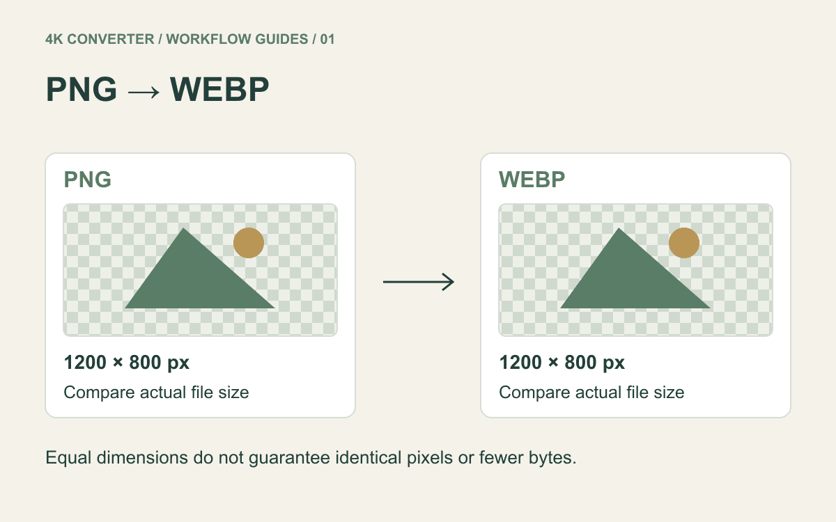
For web delivery, inspect the logo at its real rendered size on desktop and mobile. If the approved result is a PNG and the destination accepts WebP, use the PNG to WebP guide to evaluate a separate delivery copy. Keep the reviewed source for future exports.
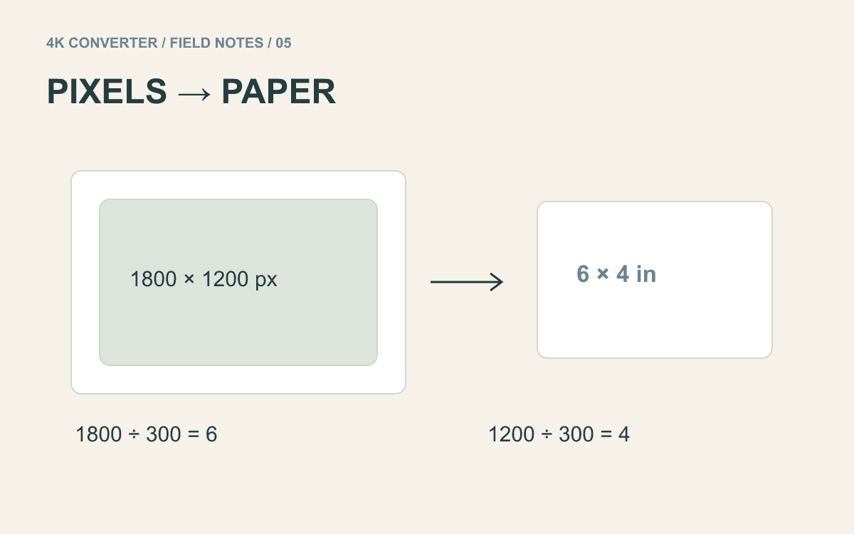
For print, ask the printer for the required dimensions, file type, and color workflow. Read image upscaling for printing before treating a pixel count as a print specification.
Common questions
Can AI enlargement make my logo into a vector?
No. This tool generates a raster image. Editable vector artwork requires an appropriate vector workflow and an accuracy review.
Will it preserve small text exactly?
Do not assume so. Compare every character and spacing detail with the approved mark. If the source is ambiguous, obtain the original rather than approving guessed lettering.
Is PNG output guaranteed to keep transparency?
PNG can store transparency, but that does not establish what an AI processing step preserved. Check the downloaded file on contrasting backgrounds before using it.
For interface captures that include text and icons together, the screenshot upscaling checklist offers a related review workflow.